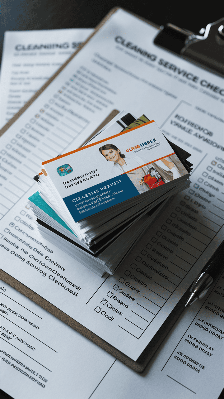
What Fonts Work Best for Cleaning Business Cards?
When it comes to designing a business card for your cleaning company, the details matter more than you think. The font you choose isn’t just about aesthetics; it’s about creating an immediate impression and making sure your contact information is easy to read. After all, if a potential client struggles to read your business card, they’re less likely to give you a call or visit your website.
This blog will guide you through choosing the best fonts for your cleaning business cards. We’ll explore legibility, branding, font combinations, and useful tools to ensure you create a professional, memorable business card that reflects the quality of your services.
Why Font Choice Matters for Cleaning Business Cards
Your business card is usually the first piece of collateral your potential customer interacts with. The font you use can tell them a lot about your business at a glance:
- Professionalism: A clean, easy-to-read font signals that you’re serious about your business.
- Brand Personality: The right font reflects your unique approach to cleaning services. Are you modern and efficient? Traditional and trusted? Your font should align with your brand identity.
- Contact Clarity: Beyond branding, fonts that are legible at a glance ensure clients can quickly see how to reach you.
Think of your font as the voice of your business card. It speaks loudly about your professionalism and reliability to potential clients.
Prioritizing Readability for Contact Information
First things first, your contact information needs to stand out. When someone picks up your business card, they should immediately be able to find your phone number, email, and website without straining their eyes.
Keep these tips in mind for readability:
- Opt for sans-serif fonts for points like phone numbers and email addresses, as they’re easier to read at smaller sizes.
- Avoid overly decorative or script fonts for critical details, especially contact information. They may look artistic but are difficult to read at a glance.
- Stick to a font size of at least 10–12 points for main text and contact details. Anything smaller risks being illegible.
Matching Fonts to Your Cleaning Business’s Style
Your font plays a huge role in communicating your brand’s personality. Should your business card look modern and sleek, or warm and inviting? The font sets that tone.
- Modern and Minimalist Cleaning Brands
Use clean, sans-serif fonts like Arial or Helvetica. These fonts give off a professional and streamlined vibe, which works well if your business emphasizes efficiency and cutting-edge cleaning techniques.
- Traditional and Trustworthy Cleaning Companies
Serif fonts like Times New Roman or Garamond evoke a sense of reliability and tradition. These are excellent for businesses aiming for a “family-owned and trusted” image.
- Friendly and Welcoming Brands
Look for rounded sans-serif fonts like Open Sans or Nunito. These add a touch of approachability while staying professional.
The key here is to think about how you want clients to feel when they see your card. Choose a font that aligns with that emotion.
Top Font Recommendations for Cleaning Business Cards
Here are some tried-and-tested fonts that work well for business cards in the cleaning industry:
Sans-Serif Fonts:
- Arial
Classic and professional, Arial is a safe choice that remains readable in any size.
- Helvetica
Known for its simplicity and cleanliness, this font screams professional and modern.
- Open Sans
A friendly and approachable sans-serif font that works beautifully for both small and large text.
Serif Fonts:
- Times New Roman
A timeless font that exudes reliability and professionalism.
- Garamond
Elegant and slightly more modern than Times New Roman, it conveys a sophisticated touch.
- Georgia
A highly readable serif font, even at smaller sizes, which makes it perfect for business cards.
By choosing one of these options, you’ll ensure your business card strikes the right notes in terms of professionalism and readability.
Combining Fonts for a Professional Look
Using two fonts on your business card can create visual interest and help organize your information better. Here’s how to pair them effectively:
- Use Contrasts
Pair a serif font with a sans-serif font to create balance. For instance, combine Garamond for your brand name with Open Sans for the contact details.
- Weight Variations
Play with font weights (bold, regular, light) within the same font family for a cohesive yet dynamic look. For example, use Helvetica Bold for your business name and Helvetica Light for your tagline.
- Limit to Two Fonts
Don’t overload your card with too many font styles. Stick to two fonts max to keep your design clean and professional.
Optimizing Font Size and Spacing for Clarity
Adjusting the size and spacing of your font is just as important as choosing the right one. Here’s how to optimize your text layout:
- Font Size
Stick to 12–16 points for your business name and larger headings, and 10–12 points for contact details and secondary text.
- Line Spacing
Use at least 1.2x line spacing for better readability. Overly cramped text can feel cluttered and hard to read.
- Kerning
Adjust the space between letters to ensure your text doesn’t look too squished or spaced out. Most design software lets you tweak this setting easily.
How Font Color Impacts Readability
The color of your font has a big impact on how easy it is to read. High contrast is key here:
- Dark Text on Light Backgrounds
Classic combinations like black text on a white background are always a safe bet.
- White Text on Dark Backgrounds
If your card’s background is dark, like navy blue or black, ensure the white text is bold to improve visibility.
- Avoid Low Contrast
Steer clear of color combinations like light gray on white or pale yellow on black, as they reduce readability.
Your goal is to make your text stand out without straining the reader’s eyes.
Resources for Designing Business Cards
To create your card, you’ll need the right tools. Here are some free and paid options:
- Canva
A user-friendly design tool with plenty of templates and font options. Great for beginners!
- Adobe Illustrator
A professional-grade design tool for a more customized look.
- Vistaprint
Not only does it offer templates, but you can also print directly. A one-stop shop for busy entrepreneurs.
These platforms allow you to experiment with fonts, layouts, and colors until you find the right combination.
Real-World Examples of Effective Cleaning Business Cards
- SparkClean
A modern cleaning brand that uses a bold sans-serif font for their logo and a lighter sans-serif font for details, creating a sleek and contemporary look.
- Fresh & Tidy Co.
Combines Garamond for their brand name with Open Sans for their contact details, exuding trust and professionalism.
- Mrs. Gleam’s Cleaning Services
Features Nunito for a welcoming vibe. They pair rounded fonts with light pastel colors to emphasize a friendly and approachable service.
Looking at successful examples can inspire you to design your own card that feels both on-brand and impactful.
Create the Perfect Business Card for Your Cleaning Service!
Your business card is more than just a way to share your contact information; it’s a representation of your brand. By prioritizing legibility, reflecting your brand personality, and using the right font combinations, you can create a card that leaves a lasting impression.
Take these tips to your favorite design tool and start experimenting with fonts today. Remember, a professional and polished business card could be the very thing that gets you your next big client!